Intro
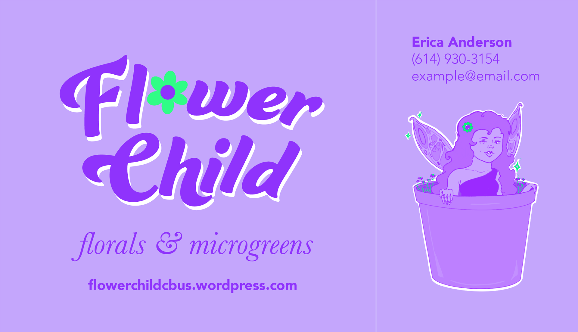
Flower Child is a Columbus, Ohio-based small business offering potted plants and microgreens. Upon the initial brainstorming session, the client, Erica, requested a colorful logo design with floral and fantasy elements. The theme and style of the logo would also be used for other branding essentials including Erica's business card and website.
Research

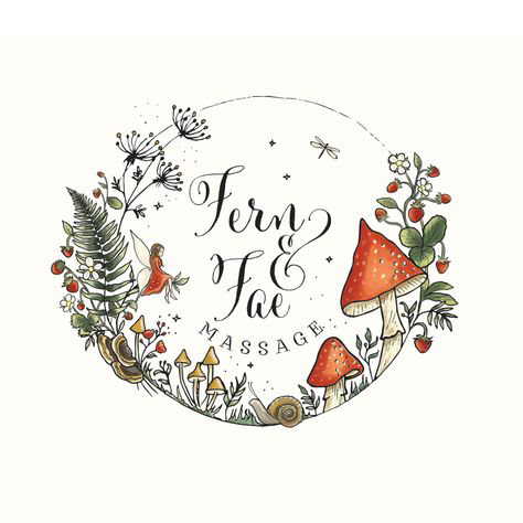
I took to Pinterest and Google Images to gather reference photos for the logo. I wanted the design to be bright and somewhat whimsical. I drew inspiration from clean and simple designs with flowers, leaves, and natural elements. The client and I agreed to keep the color palette simple with her complimentary choices of green and purple.
Process
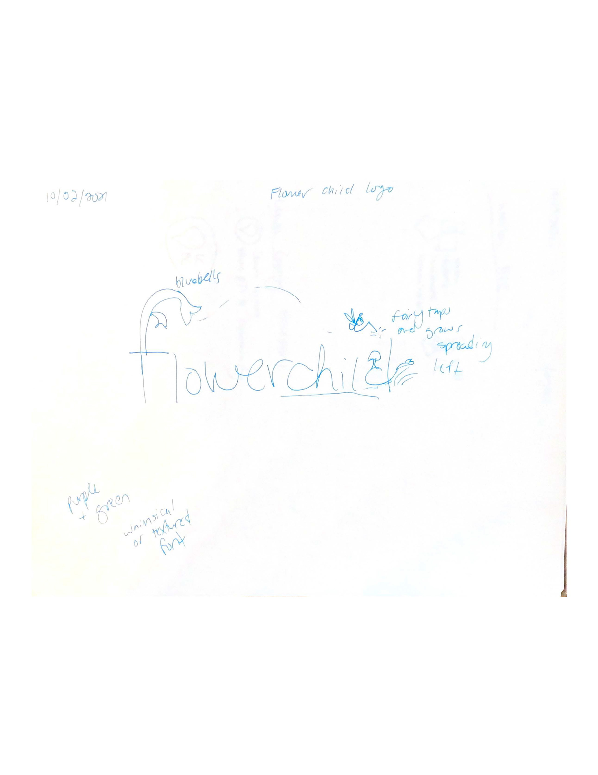
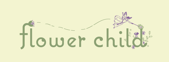
As with any project, I started with a paper sketch. Initially, I pictured a text-based logo with a small fairy adding floral embellishments as the letters progressed. Upon the first draft, however, the design was not resonating with me, and I knew I could do better. I wanted to keep the "flower fairy" concept, but I recognized that the graphic is just as important as the text regarding logo design.
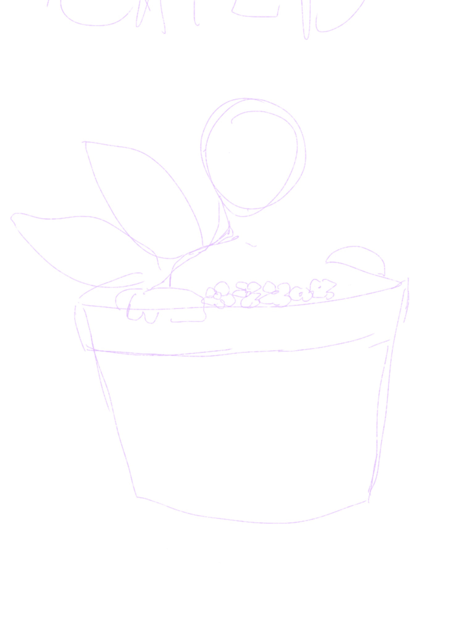
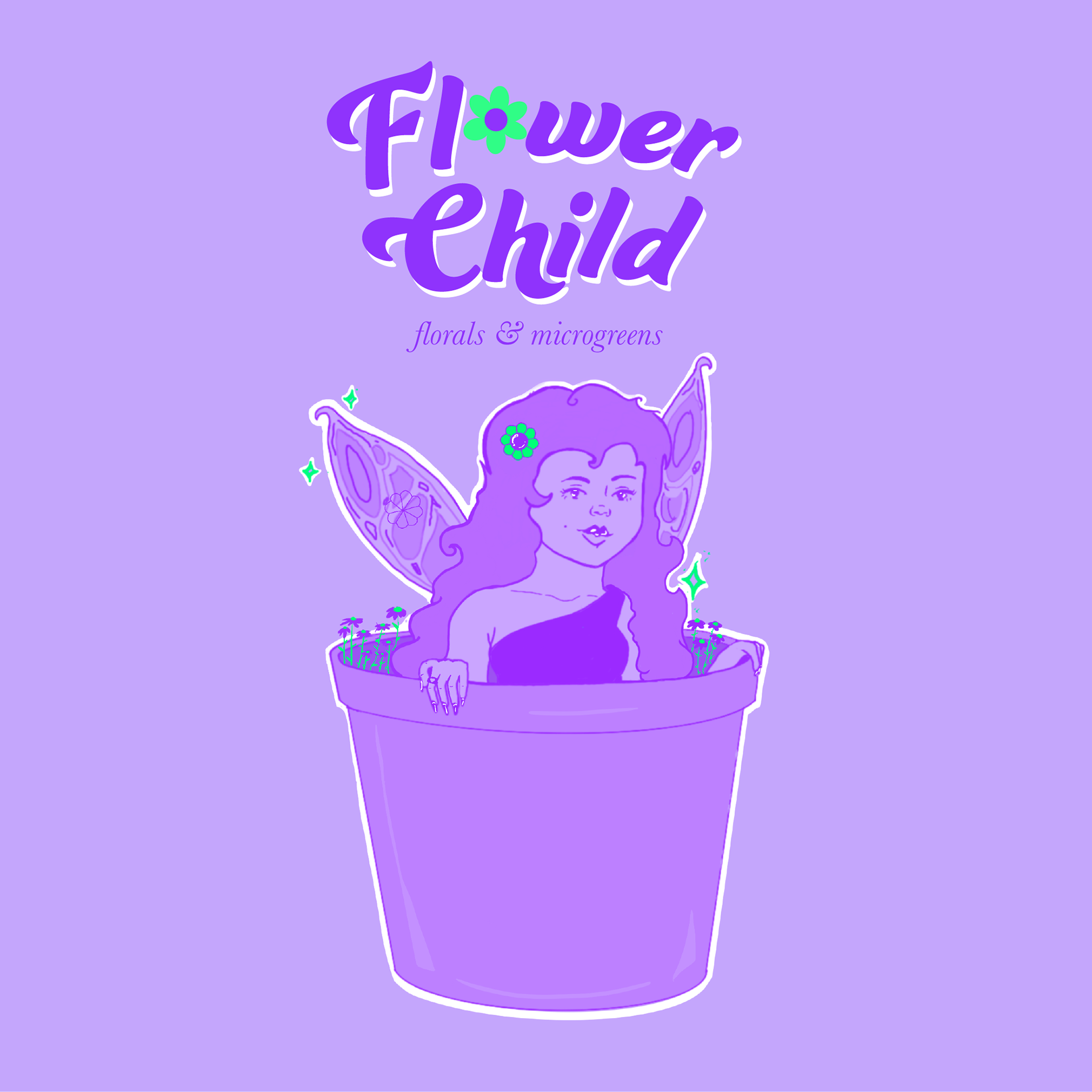
After trying to make it work, I started over from scratch with a new sketch. Feeling inspired, I drew a whole new illustration in one sitting. Upon consulting with the client, Erica expressed her enthusiasm for the work and requested only minor changes. The final design is bright, whimsical, and gives the viewer a sense of delight.

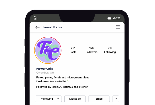
Application
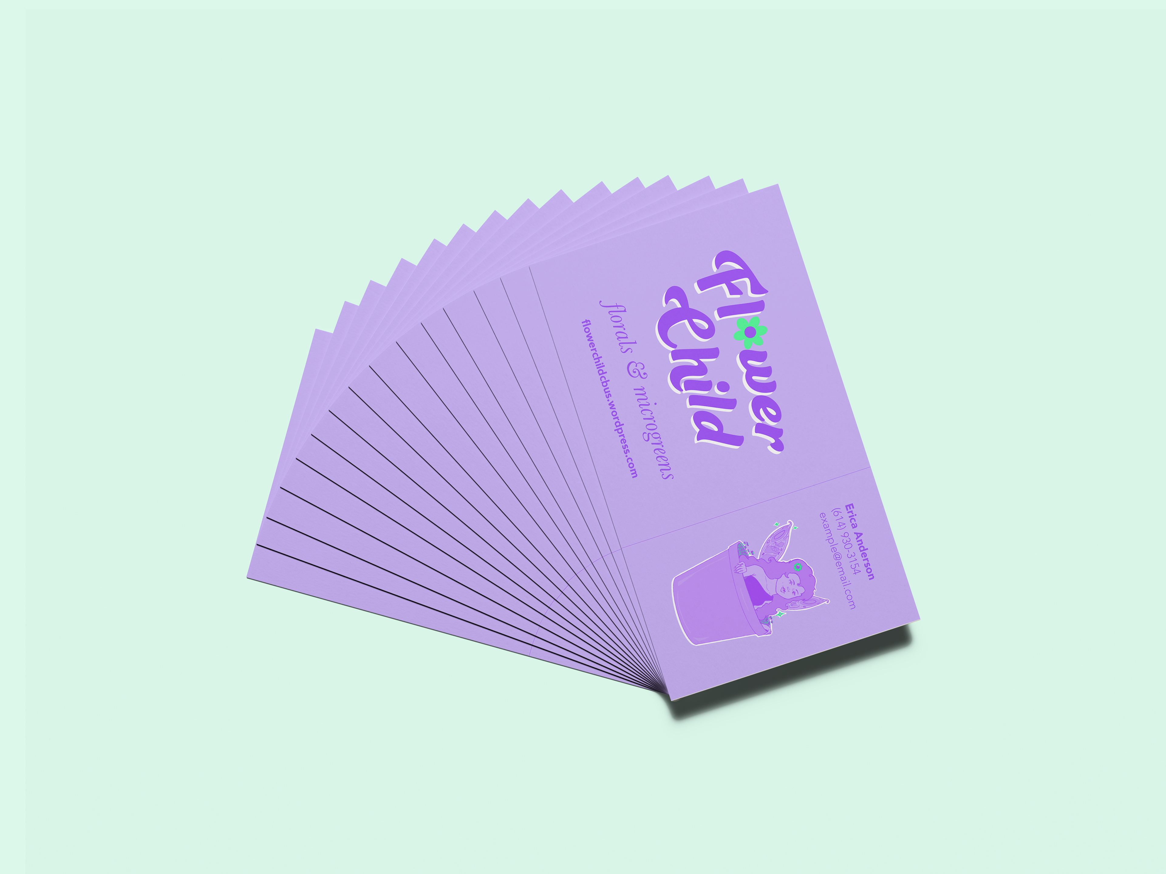


My experience with the project taught me so much. For example, I was reminded how to push through and hold myself to high standards when it comes to my work. I gained great experience with branding and practiced translating a design across different mediums, from a social media profile picture to a business card. The Flower Child project was a landmark freelance case for me, and still inspires me to continually seek to elevate my work!