Intro
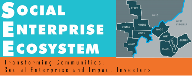
The Social Enterprise Ecosystem is a program based out of the Voinivich School at Ohio University. During my senior year at OU, I was the graphic design intern for SEE.
I took on a range of projects with different SEE clients. Aside from working with clients, I was also asked by my supervisor, Erin Rennich, to redesign the SEE logo. The old logo was slightly dated and had little artistic appeal. Erin asked me to come up with a new logo that would factor in the location of SEE clients, keep the SEE colors, and bring a fresh new look to the typography.
Research




Using keywords, I collected images relating to the words "social enterprise" and "ecosystem." I needed to find a way to show some idea of interconnectedness and also represent Ohio in some way. I sought ways to signify this concept without resorting to cliches.
Process
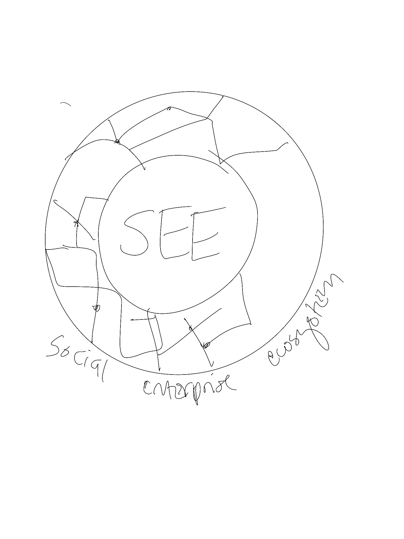
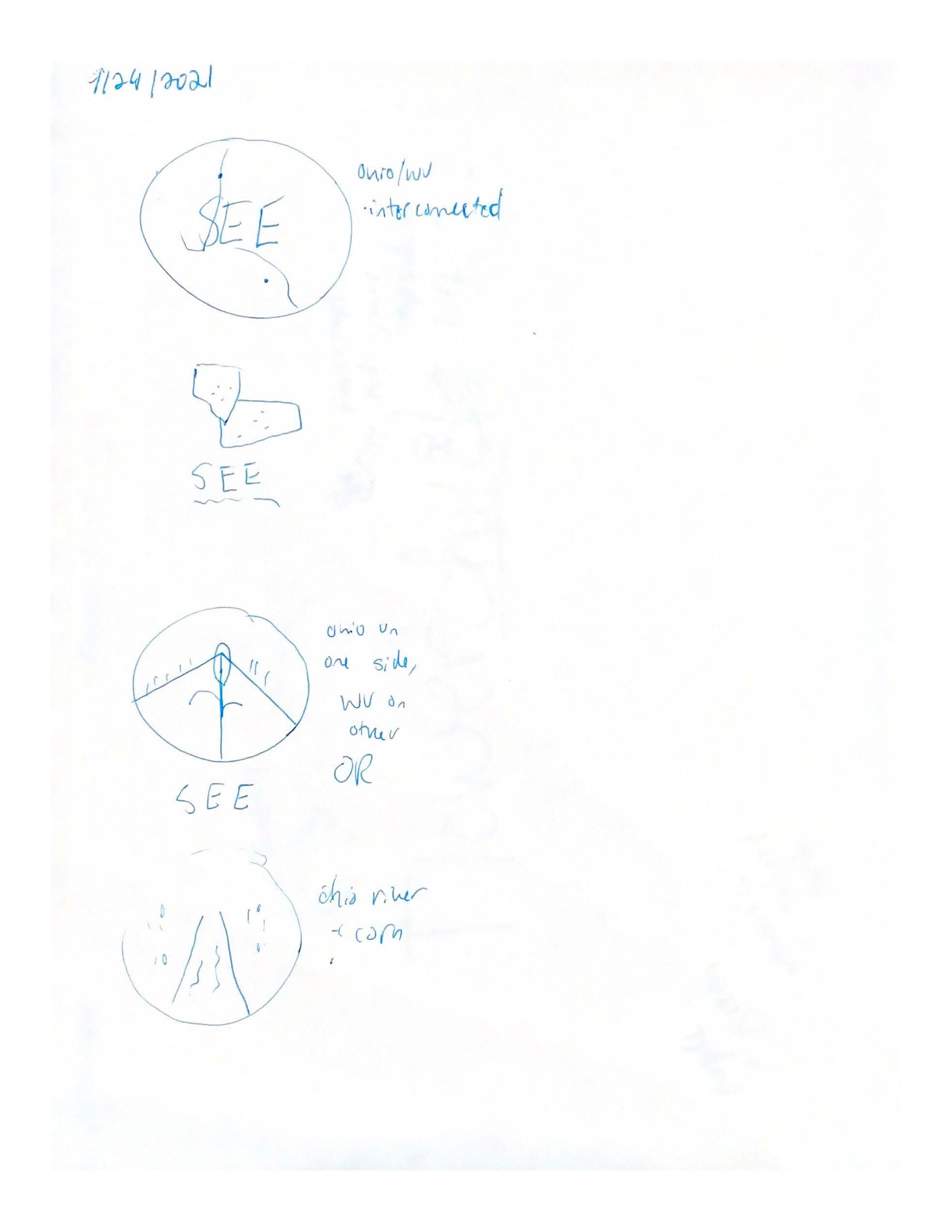
I began the new logo with a few sketches, experimenting with the composition of the design and how to best highlight the typography.
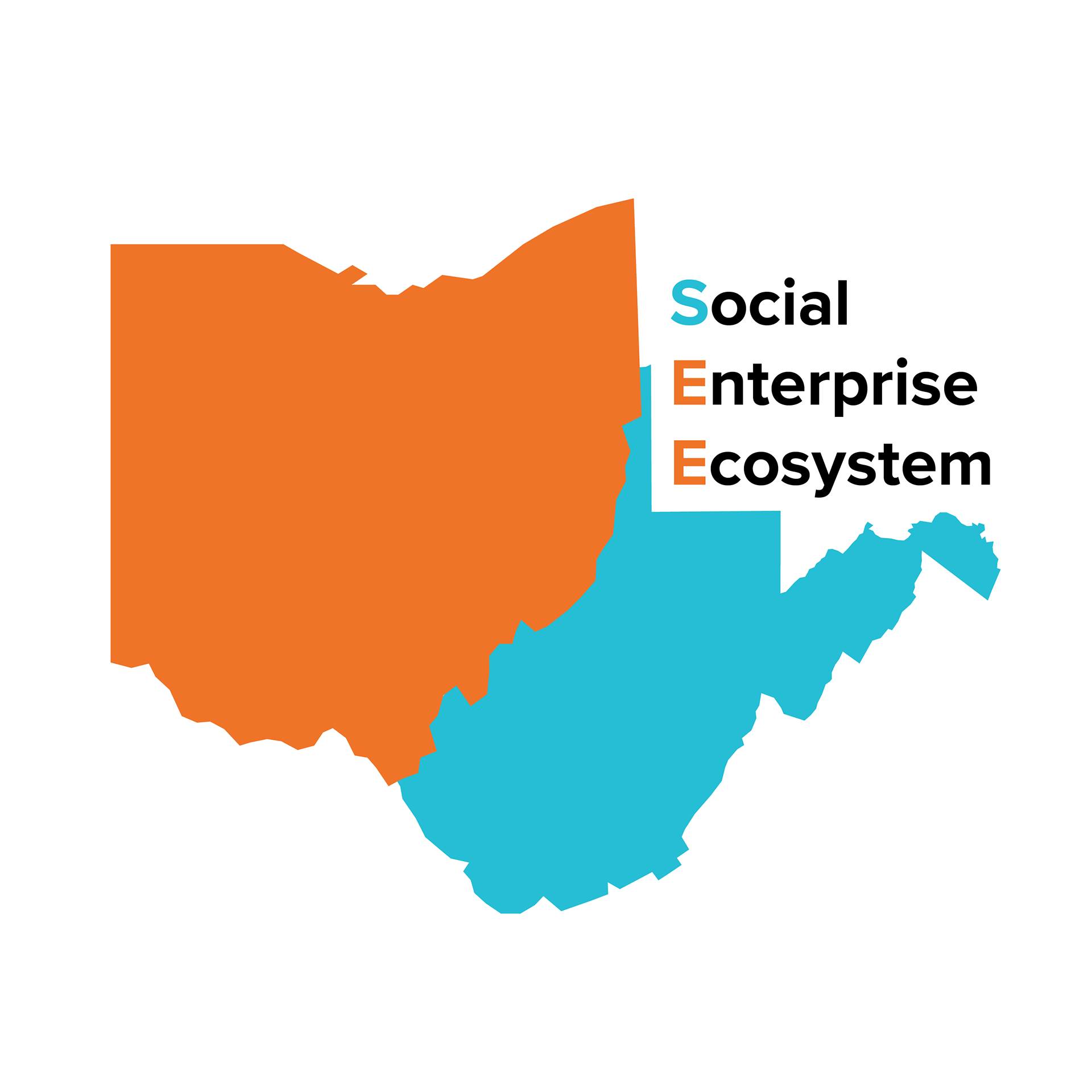

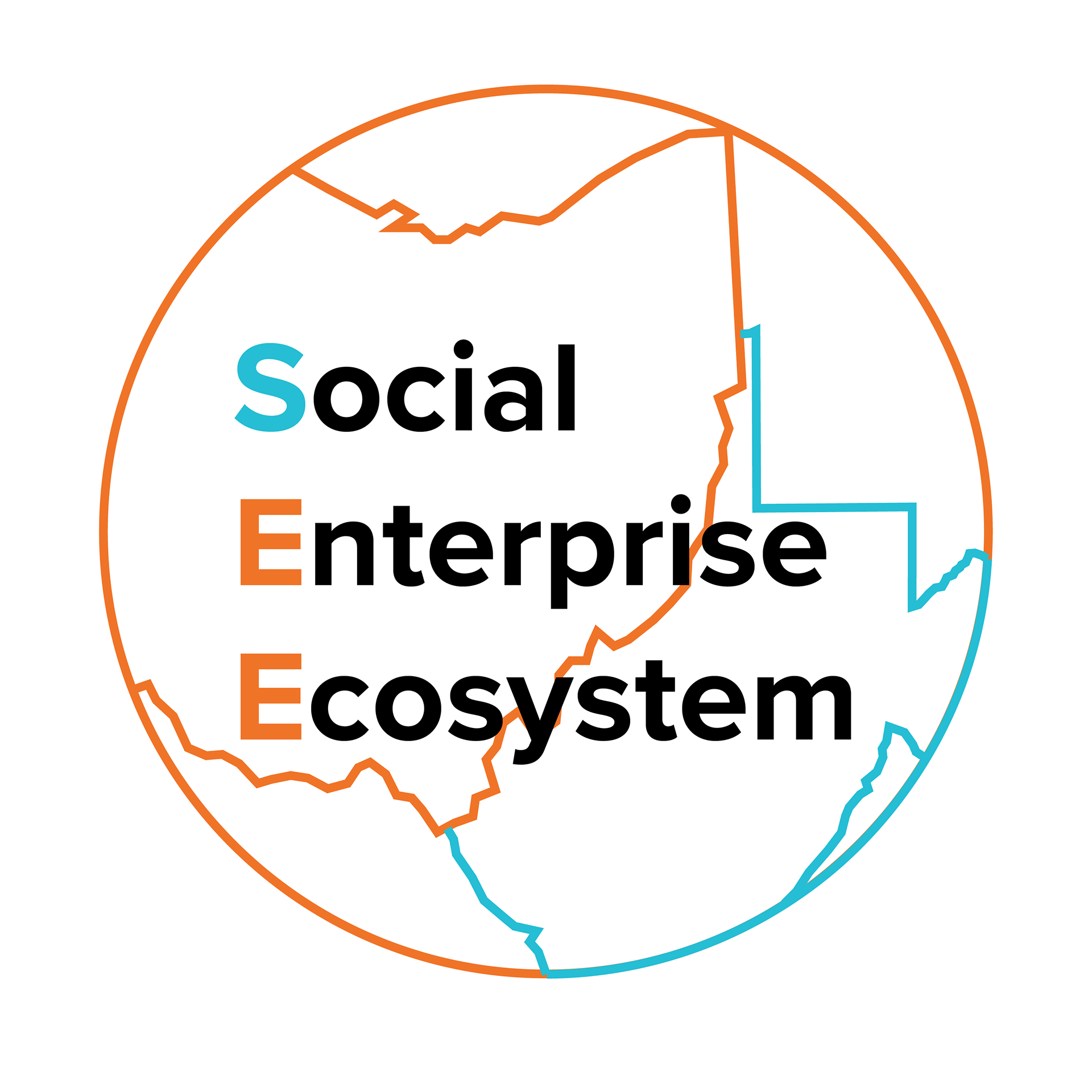

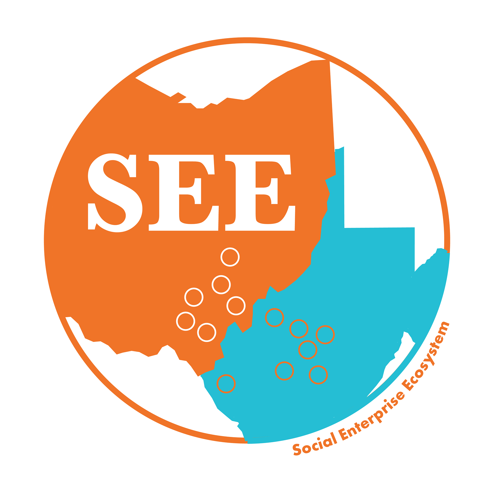
I then moved to Adobe Illustrator and started with drafting five alternate versions of a new logo. There were two main concepts I had in mind: a version with a map or a more "natural" edition featuring the Ohio countryside and crops. My superiors preferred the draft with the map so we took that idea and ran with it. As with any clients, there were several rounds of revisions and emails back and forth over type choices and colors before we decided on the final draft, The final deliverables consisted of two logos: the official one on the left and a social media version on the right.


Application
Redesign projects are one of my favorite things to do: I enjoy looking at designs and challenging myself to think about how I would do them differently. I notice what I might improve, or how the previous designer did something that I might not have thought to do. It is also a humbling reminder that one's work can always be refreshed over the years. I thoroughly enjoyed this project not only for the design experience but because I was working directly with my supervisor and SEE team on it. The new logo (and banner that I created to go with it) is a way I was able to elevate my company's branding, and I was proud to do so!