Intro
I took an infographics class during the fall of my junior year at Ohio University. We studied data visualization and how to present information in a visually pleasing way. Our final project was to create a science-based mega-graphic: a large infographic containing at least four data sets.
Research

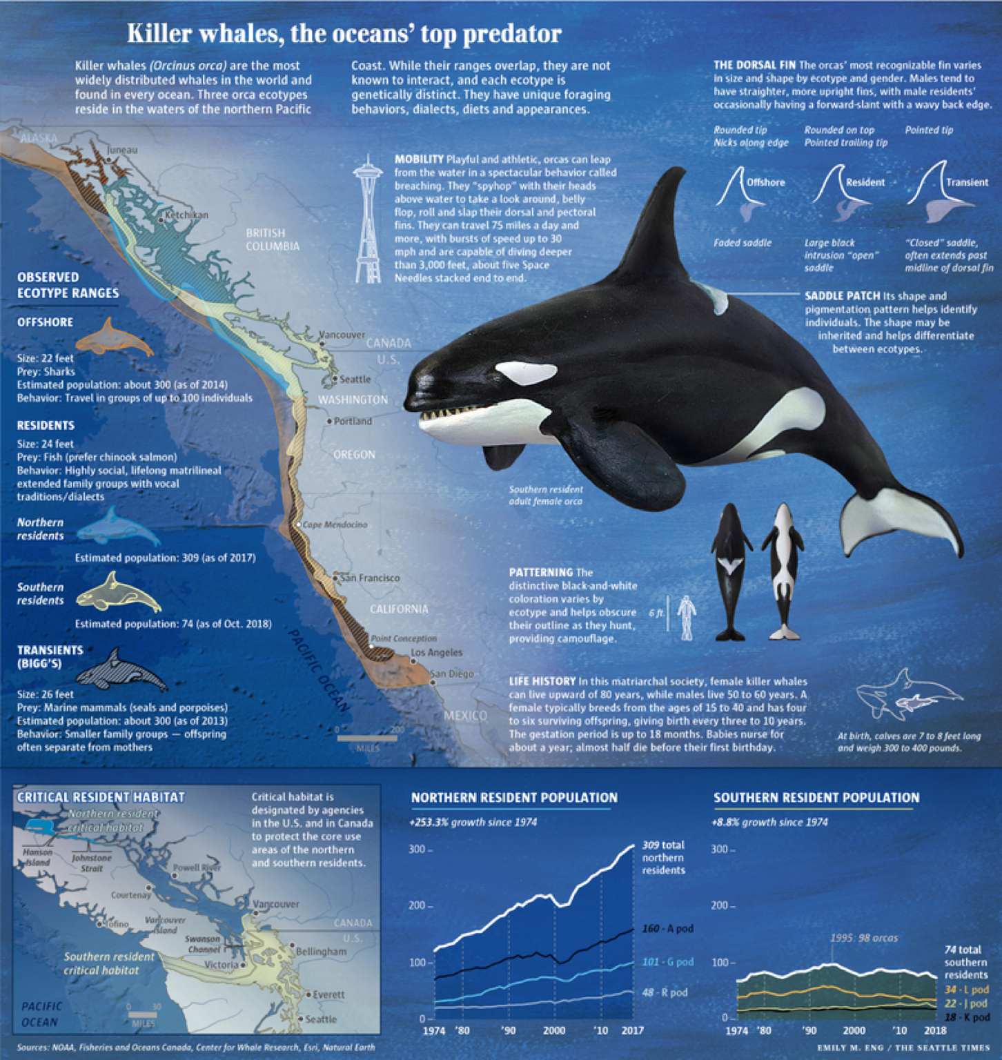
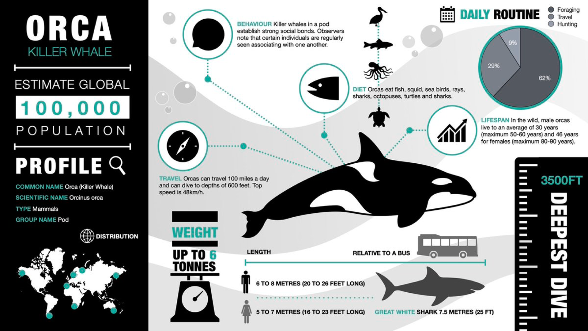
To prepare for this project, I looked at other infographics about whales and studied how the designer used layout, orientation, and visual hierarchies. I felt inspired by the work that I saw and I was very interested in this topic as someone who is fascinated by all animals. I read many articles about sea parks and aquatic mammals to gather data and get a better understanding of their relationships. In addition, I also watched the documentary Blackfish, about the deaths of several sea park employees due to the orcas.
Process


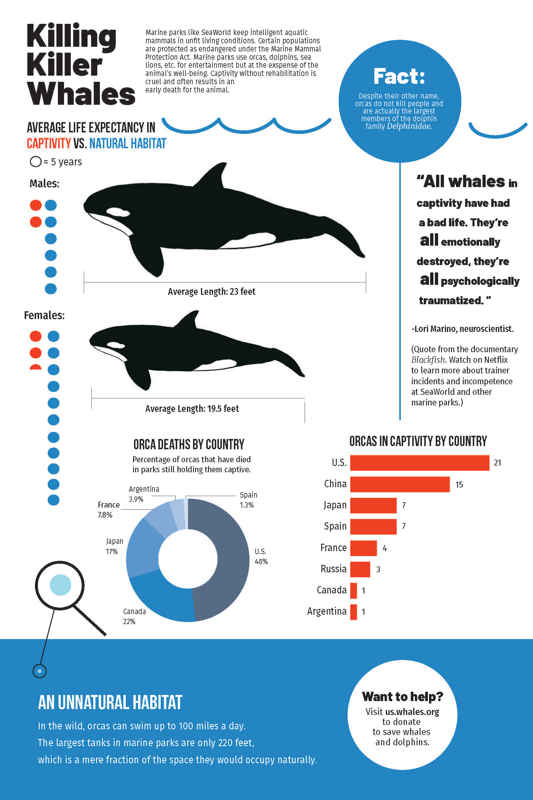
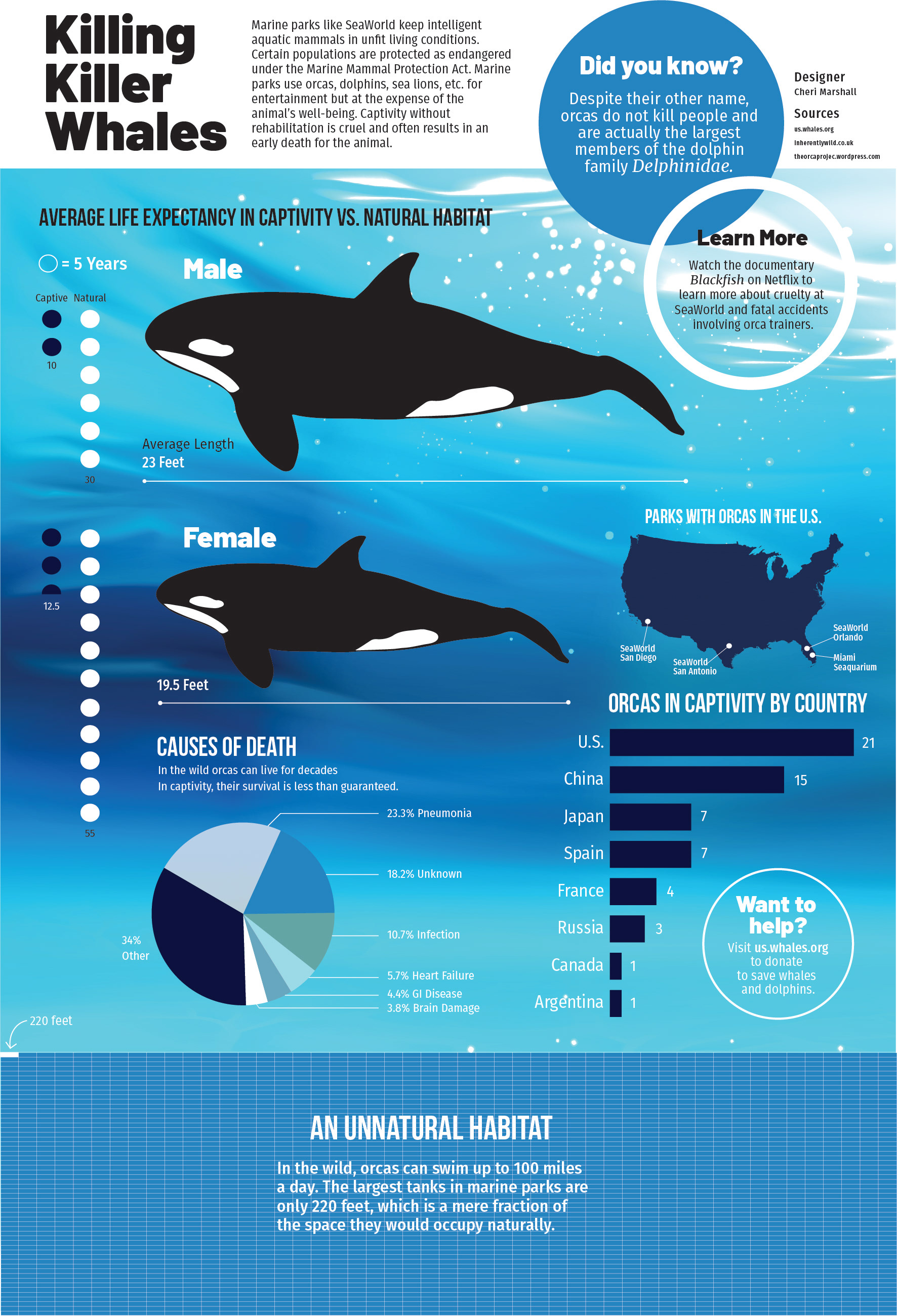
Initially, I hadn't settled on orcas alone and planned to draw some comparisons between different species at sea parks. However, my professor encouraged me to focus on orcas and I agreed: orcas are a majority of the attraction at places like SeaWorld, and they also have a misunderstood reputation, hence the nickname "killer whale."
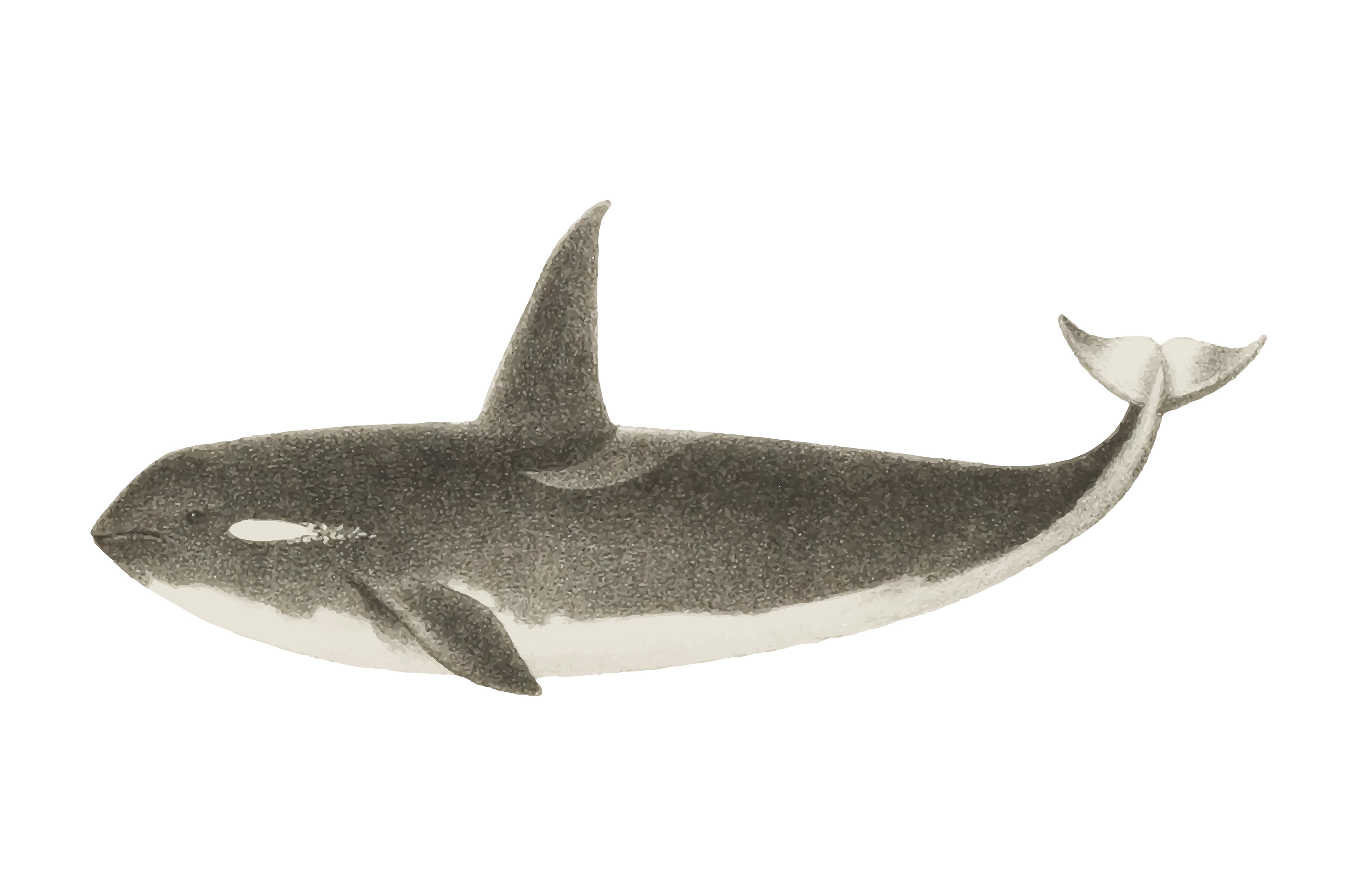
I started with a paper sketch and drew up a rough draft in Adobe Illustrator. Once my research was done and I had enough data, I created a new version with a more refined layout and a whale illustration that I drew on my iPad.
After critique with my class, I applied the constructive criticism I received to create the final version. The mega-graphic is chock-full of data but is easy on the eyes. The cool blues and whites make for a great color palette, and the subject matter is intriguing.
Application

This project was a great way to practice layout design. It taught me how to make complex data visualization look simple. The infographics course was essential to my visual communications studies: it strengthened my skills and gave me an eye for data. It taught me how to present facts visually and also how to spot errors or misleading data presented by others.
I even took this project another step further by animating the graphic in Adobe After Effects! This bonus material was done for a motion graphics class I took in the spring of my junior year.
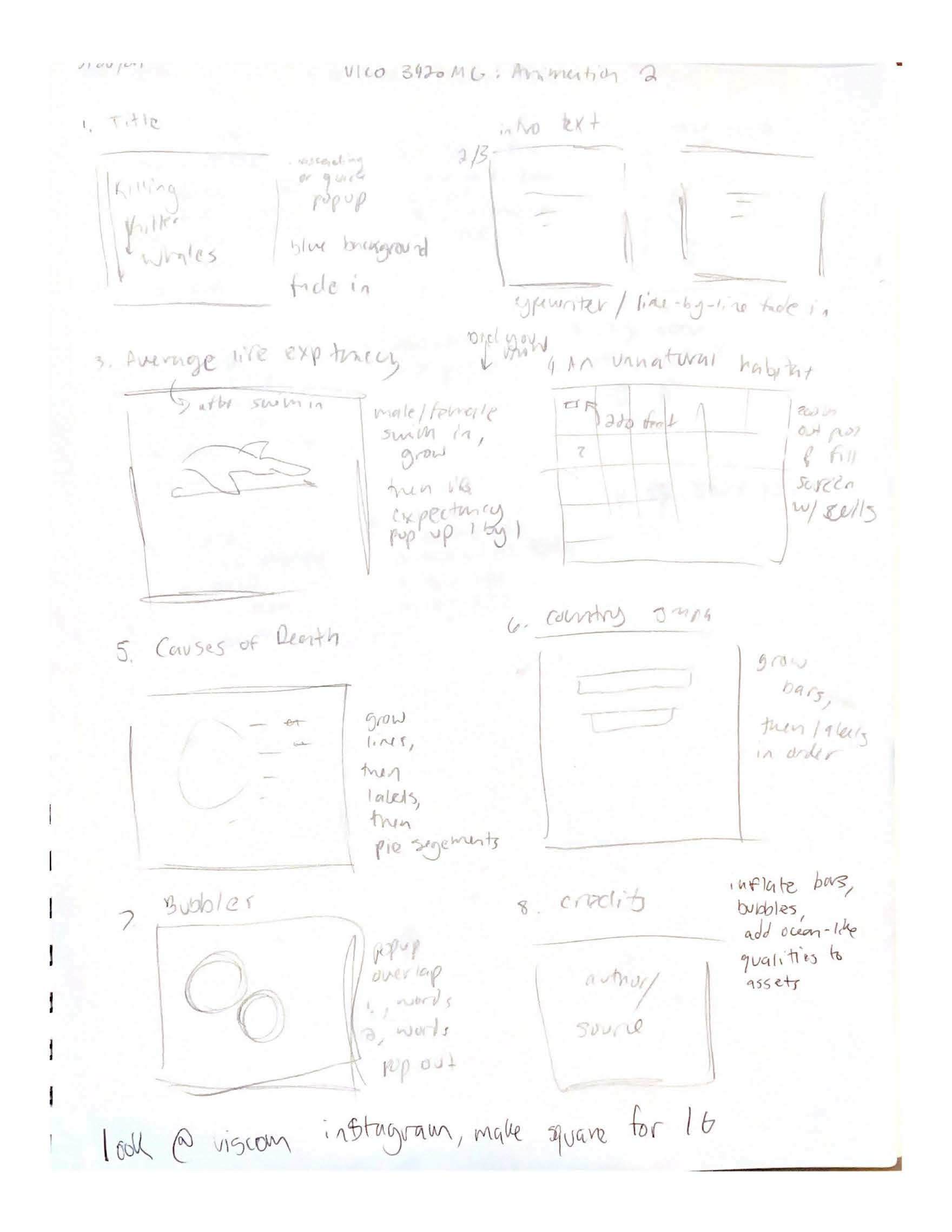
Storyboard for animation